


Seller's website: ecommerce platform
Seller's website: ecommerce platform
overview
overview
The company had a social media and e-commerce app for content and local product purchases, but sellers used an outdated version for order management, causing many issues. To fix this, the company planned to launch a website with better features and accessibility, addressing the sellers' problems.
The company had a social media and e-commerce app for content and local product purchases, but sellers used an outdated version for order management, causing many issues. To fix this, the company planned to launch a website with better features and accessibility, addressing the sellers' problems.
About
About
Duration: Nov '21 - May '22
Role: UI & UX Designer
Software: Figma
Duration: Nov '21 - May '22
Role: UI & UX Designer
Software: Figma
Individually designed & managed project
Individually designed & managed project
Approach
Approach
Various research methods in design were employed to create a user-centered seller's website
Various research methods in design were employed to create a user-centered seller's website
User Needs Assessment:
Identified and understood the specific needs of sellers using the existing app.
Conducted surveys, interviews, and usability testing to gather feedback and preferences.
Identified and understood the specific needs of sellers using the existing app.
Conducted surveys, interviews, and usability testing to gather feedback and preferences.
Competitive Analysis:
Analyzed competitor websites and platforms to identify successful features and potential improvements.
Evaluated industry best practices and emerging trends in e-commerce website design.
Analyzed competitor websites and platforms to identify successful features and potential improvements.
Evaluated industry best practices and emerging trends in e-commerce website design.
Feature Prioritization:
Prioritized features based on user needs, industry standards, and the identified shortcomings of the existing app.
Collaborated with stakeholders to determine critical functionalities for the sellers.
Prioritized features based on user needs, industry standards, and the identified shortcomings of the existing app.
Collaborated with stakeholders to determine critical functionalities for the sellers.
Usability Testing:
Developed prototypes or wireframes for the website design.
Conducted usability testing sessions with existing sellers to identify any usability issues and gathered insights for improvement.
Developed prototypes or wireframes for the website design.
Conducted usability testing sessions with existing sellers to identify any usability issues and gathered insights for improvement.
Content Strategy:
Defined a content strategy to ensure that the website effectively communicated key information to sellers.
Optimized content for search engines and user engagement.
Defined a content strategy to ensure that the website effectively communicated key information to sellers.
Optimized content for search engines and user engagement.
Responsive Design Considerations:
Researched and implemented responsive design principles to ensure the website was accessible and functional across various devices and screen sizes.
Researched and implemented responsive design principles to ensure the website was accessible and functional across various devices and screen sizes.
Accessibility Standards:
Researched and implemented accessibility standards to ensure the website was inclusive and complied with accessibility guidelines.
Researched and implemented accessibility standards to ensure the website was inclusive and complied with accessibility guidelines.
Feedback Loop:
Established a feedback loop with stakeholders, users, and development teams throughout the design process.
Iterated on the design based on continuous feedback and testing results.
Established a feedback loop with stakeholders, users, and development teams throughout the design process.
Iterated on the design based on continuous feedback and testing results.

Findings
Findings
Sellers primarily consisted of individuals aged 40 and above, indicating a demographic preference among older adults for engaging in e-commerce activities.
The priority for sellers was a simple interface over extensive features, suggesting a preference for streamlined functionality over complex processes.
There was a clear demand for improvements in the selling and shipping processes to facilitate easier management of orders, indicating a need for enhanced usability and efficiency in these areas.
Solutions
Solutions
Developed an easy-to-use website tailored to the needs of older sellers, featuring intuitive navigation and engaging onboarding processes to ensure a seamless transition to the new platform.
Streamlined the order management and shipping processes on the website, implementing user-friendly interfaces that simplify tasks for sellers, thus enhancing efficiency and reducing manual efforts.
Ensured consistency between the website and the existing app to maintain familiarity for users, while also enhancing certain features to improve functionality and usability.
Identified and integrated essential features lacking in the app onto the website, addressing gaps in functionality to provide a comprehensive platform for sellers to effectively manage their accounts and transactions.

Key Changes Implemented compared to app
Key Changes Implemented compared to app
Onboarding Process:
The previous app lacked a formal onboarding process for sellers, relying on manual data entry by office staff.
A new self-registration system was designed, enabling sellers to create accounts and input their own data.
Office staff would then verify and activate accounts, reducing administrative burden and providing seamless registration for sellers.
Order Acceptance Flow:
The app previously lacked the ability for sellers to reject orders, leading to complexities in order processing.
A new flow was implemented allowing sellers to accept or reject orders, ensuring they could manage orders efficiently and accept only those they could fulfill.
Feature Streamlining:
Several underutilized features, such as event organization, were identified in the app.
These features were removed to streamline the website, reducing clutter and complexity.
This decision was made to cater to the predominantly older target audience and ensure a simpler, more intuitive user experience.

key changes
key changes
Registration Time: Target 10 minutes.
Verification Time: Target 1 business day.
Registration Rate: Aim for 20 new sellers/month.
Satisfaction Score: Aim for 4.0+ out of 5.
Registration Time: Target 10 minutes.
Verification Time: Target 1 business day.
Registration Rate: Aim for 20 new sellers/month.
Satisfaction Score: Aim for 4.0+ out of 5.
Seamless Registration: Easier seller account creation.
Less Admin Work: Reduced manual data entry for staff.
Better Seller Experience: Streamlined registration process.
Seamless Registration: Easier seller account creation.
Less Admin Work: Reduced manual data entry for staff.
Better Seller Experience: Streamlined registration process.
Onboarding
Process
Onboarding Process
outcomes
outcomes
metrics
metrics
Improved Order Management: Sellers can accept/reject orders.
Simplified Processing: Easier handling of orders.
Rejection Rate: Estimate 10-20%.
Processing Time: Target 5 minutes/order.
Fulfillment Rate: Aim for 90%+.
Satisfaction Score: Aim for 4.0+ out of 5.
Order Acceptance
Flow
Order Acceptance Flow
outcomes
metrics
Simpler User Experience: Less clutter.
Better Usability: Easier navigation.
Feature Use: Aim for 80% core feature use.
Engagement Time: Target 15 minutes/session.
Task Completion: Aim for 90%.
Satisfaction Score: Aim for 4.0+ out of 5.
Support Requests: Less than 20/month.
Feature
Streamlining
Feature Streamlining
outcomes
metrics
outcomes and metrics
outcomes and metrics
Personality
Polite
Hard-working
Honest
Goals
Goals
Increase Online Sales: Utilize the e-commerce platform to expand his customer base beyond local shoppers.
Streamline Operations: Efficiently manage inventory, orders, and shipments to save time and reduce errors.
Customer Engagement: Improve customer engagement and retention through better online service.
Pain-points
Pain-points
Inventory Management: Difficulty tracking inventory across both physical and online stores.
Order Tracking: Needs a more intuitive way to manage and track online orders.
Time Management: Finds it challenging to balance in-store responsibilities with online operations.
Technical Skills: Limited technical expertise makes it difficult to navigate complex interfaces.
Language Barrier: Prefers using platforms that support Hindi or Marathi in addition to English.
Motivations
Motivations
User-Friendly Interface: Simple, intuitive design without extensive technical knowledge.
Inventory Syncing: Seamless synchronization between physical and online stores.
Order Management Tools: Easy tools for managing orders, shipments, and returns.
Mobile Access: Manage store on-the-go via a responsive mobile platform.
Support and Training: Access to customer support and training resources.
Multilingual Support: Interface available in Hindi and Marathi.
Vinod Kumar
Vinod Kumar
Male 42, Pune
Male 42, Pune
Business Type: Clothing Store
Experience: 15 years in retail, 2 years selling online
Store Size: Medium-sized store with a varied inventory of men's, women's, and children's clothing
Sales Platform: Offline and online
Business Type: Clothing Store
Experience: 15 years in retail, 2 years selling online
Store Size: Medium-sized store with a varied inventory of men's, women's, and children's clothing
Sales Platform: Offline and online


"Festivals are the best times for small businesses like us"
"Festivals are the best times for small businesses like us"
Technical proficiency
IT & Internet
Device / mobile
Social media
Additional comments
Vinod is a dedicated entrepreneur aiming to expand his business by leveraging online shopping to reach a larger audience.
User Persona
User Persona
Design Process
Design Process
Low-fidelity wireframes
Low-fidelity wireframes
The preliminary page layouts were hand-sketched on paper to brainstorm layout concepts and strategize content organization.
The preliminary page layouts were hand-sketched on paper to brainstorm layout concepts and strategize content organization.

Style-guide
Style-guide
The design of the website adhered to the same style guide as the existing app, ensuring consistency across all platforms and maintaining a cohesive product experience.
The design of the website adhered to the same style guide as the existing app, ensuring consistency across all platforms and maintaining a cohesive product experience.
Spacing and size
Spacing and size
The design employed a spacing scale based on multiples of 4 pixels to ensure consistent and harmonious spacing throughout the interface.
The design employed a spacing scale based on multiples of 4 pixels to ensure consistent and harmonious spacing throughout the interface.
Typography
Typography
Typography: The typeface used was the different fonts of Lato and Poppins. These sans serif typefaces were used as they complement each other and offer good readability even on the small screens of mobiles.
Typography: The typeface used was the different fonts of Lato and Poppins. These sans serif typefaces were used as they complement each other and offer good readability even on the small screens of mobiles.
Lato - Body text
Lato - Body text
Poppins - Titles and headings
Poppins - Titles and headings
Colors
Colors
The color scheme featured a variant of blue as the primary color, complemented by a variant of purple as the secondary color. Additionally, there were a few tertiary warning colors, along with various shades of grey, black, and white, ensuring a balanced and cohesive visual aesthetic.
The color scheme featured a variant of blue as the primary color, complemented by a variant of purple as the secondary color. Additionally, there were a few tertiary warning colors, along with various shades of grey, black, and white, ensuring a balanced and cohesive visual aesthetic.
#3F7EFF
Primary: The chosen shade of blue symbolizes security, trust, loyalty, and responsibility, making it ideal for an e-commerce platform. This hue was consistently applied to all buttons and significant highlights throughout the website, reinforcing the platform's reliability and credibility.
#7472ED
#903FFF
#0F0E2D
Secondary: These complementary shades were utilized for secondary tasks, harmonizing with the primary color scheme to maintain visual coherence and enhance user experience.
#FBA824
#43B475
#FF575A
Tertiary: These shades were strategically allocated to signify various messages: warning, success, and error, respectively. This approach ensured clear communication and user guidance throughout the platform.
#F4F3F8
#F4F3F8
#E6E6E6
#E6E6E6
#D5D5D5
#D5D5D5
#979EA4
#979EA4
#000000
#000000
#ffffff
#ffffff
Greys: The shades of grey were designated for indicating disabled buttons, their borders, and placeholder texts, among other elements. Meanwhile, black color was employed for textual content throughout the platform, ensuring clarity and readability.

how it works
how it works
User Categories:
The website caters to three user types: sellers (selling products), restaurants (selling food items), and service providers (offering services like consulting, real estate, etc.).
User Authentication and Dashboards:
Users can either log in to existing accounts or sign up for new ones. Upon logging in, they are directed to tailored dashboards. Restaurants have distinct webpages, while service providers share a dashboard similar to sellers but without product management capabilities.
Seller Registration:
New sellers register via a step-by-step onboarding process, verifying their identity with a one-time password and entering their details page by page.
Order Management:
Sellers receive orders from customers, which can also include off-platform orders. The platform offers shipping services categorized as Quick delivery, Standard delivery, and Scheduled delivery, with app orders processed as Standard delivery.
Dashboard Features:
Sellers access various sections including Book Delivery for shipping services, All Products for managing the product catalog, My Profile for personal details management, Wallet for adding funds for shipping charges, Reports for sales and revenue monitoring, and Logout for account logging.
The interface design
The interface design


homepage
homepage
The landing page was designed to be simple yet appealing, with minimal information and easy login/signup options. Sellers, restaurants, and service providers could sign up according to their needs. The page highlighted platform services, provided registration instructions, and included testimonials from satisfied users.
The footer featured essential links and app download options, along with social media access.
Design workflows covered all use cases, including specific error messages during login to enhance user experience.


Dashboard
Dashboard
Upon login, the seller is directed to the dashboard with "Book Delivery" as the first tab, prioritizing this primary service due to its high usage among sellers.
Sellers can easily book any delivery, choosing from options such as Standard delivery (2-4 days), Quick delivery (a few hours), or Scheduled delivery (any future date).
The section also provides quick access to recent orders, facilitating efficient order management.
In the mobile version, the side menu transitions into the hamburger menu, ensuring consistent navigation across different devices.


Delivery booking
Delivery booking
Quick Delivery:
Uses the shipping service for personal off-platform orders.
Pickup address is saved by default.
Seller selects the drop location on the map, enters house/building details, recipient info, product name, and weight.
Delivery charge is based on distance and weight.
Payment is made through the payment portal.
Standard Delivery:
Same process but map location is optional; address can be typed.
Managed by the company, not requiring exact map locations.
Same process but map location is optional; address can be typed.
Managed by the company, not requiring exact map locations.
Scheduled Delivery:
Allows scheduling of delivery date and pickup time.
Seller chooses vehicle type (two-wheeler or four-wheeler).
Payment is made after confirming the pickup details.
Allows scheduling of delivery date and pickup time.
Seller chooses vehicle type (two-wheeler or four-wheeler).
Payment is made after confirming the pickup details.
onboarding of sellers
onboarding of sellers
Seller selects the register button on the landing page.
A dialog box appears for inputting data:
- Personal details
- Business details
- Location details
- Document details
- Bank details
- Account passwordsAnimations follow each data entry page to maintain engagement.
Placeholder texts in input fields assist users.
Account is created and verified by the team.
Seller can explore platform services until verification.
Similar animations are used in desktop and mobile versions.


Products & inventory
management
Products & inventory
management
Sellers can manage their product catalog by adding, removing, and updating products, prices, and availability. There are two categories:
Products: Manage individual items.
Collections: Manage groups of products.A total product count is displayed, with search, share, and delete options. Availability status is shown for each product.
Sellers can add detailed product information, including price, weight, tags, length, material, and custom variants (e.g., Pendrive with 32GB or 64GB). Images can also be added. Variants are optional. After entering details, the product can be saved.
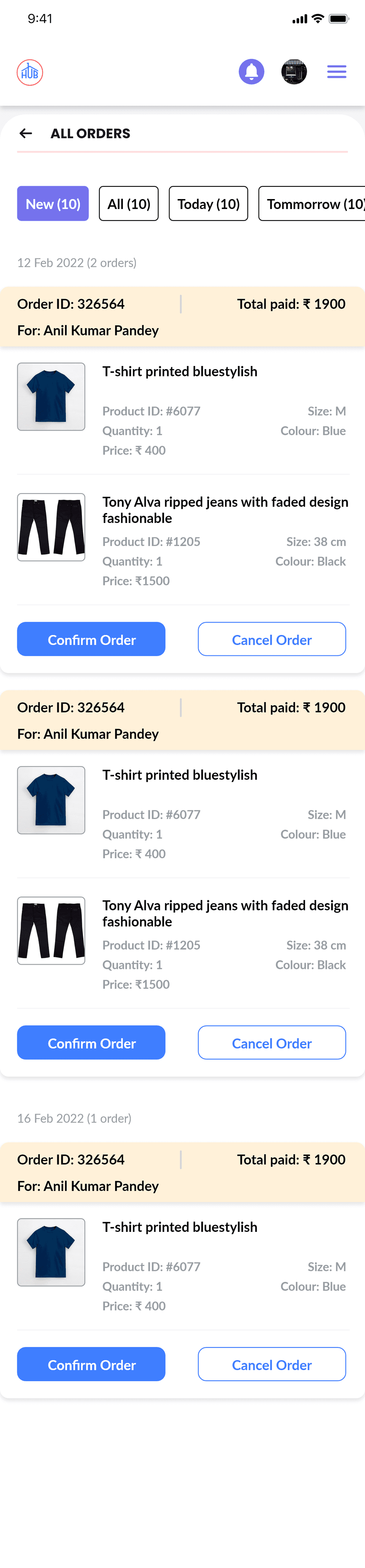
orders management
orders management
Sellers can manage all orders, including those from the e-commerce app and personal shipments. They can view new orders, all orders, and orders scheduled for shipment today, tomorrow, and this month.
Sellers can manage all orders, including those from the e-commerce app and personal shipments. They can view new orders, all orders, and orders scheduled for shipment today, tomorrow, and this month.
Order Actions:
Accept or reject orders.
Accepted orders move to the "All Orders" section.
Rejected orders prompt a confirmation box where the seller can select a cancellation reason.
Accept or reject orders.
Accepted orders move to the "All Orders" section.
Rejected orders prompt a confirmation box where the seller can select a cancellation reason.
Order Details:
Orders are listed by date in the "All Orders" tab.
Details include customer name, order ID, product ID, price, variant, image, quantity, and total price.
Orders are listed by date in the "All Orders" tab.
Details include customer name, order ID, product ID, price, variant, image, quantity, and total price.
Delivery Management:
View and book deliveries from the "All Orders" section.
Scheduled pickup times and dates are displayed.
A delivery agent is assigned for pickup.
Sellers are notified upon delivery completion.
View and book deliveries from the "All Orders" section.
Scheduled pickup times and dates are displayed.
A delivery agent is assigned for pickup.
Sellers are notified upon delivery completion.


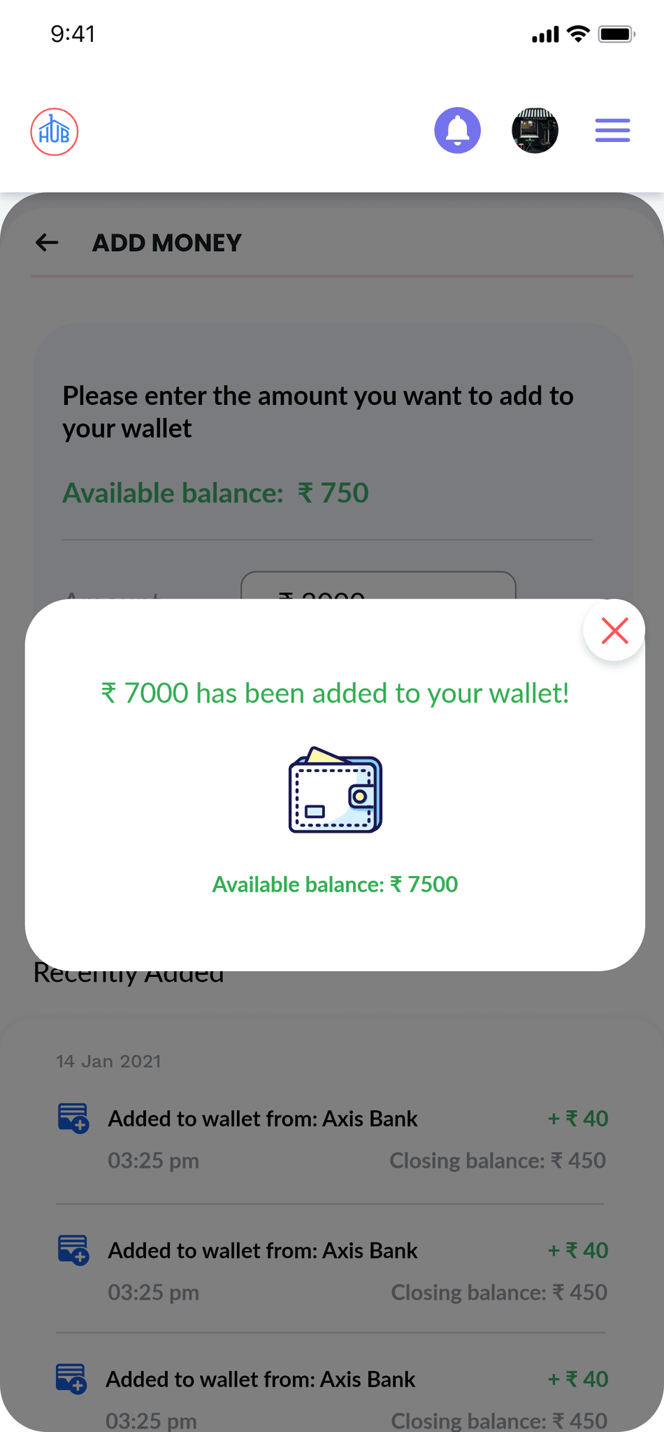
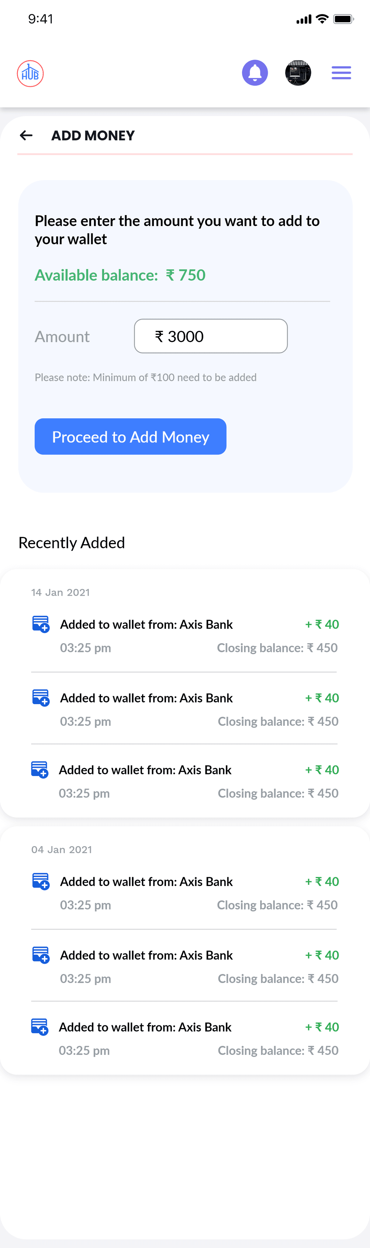
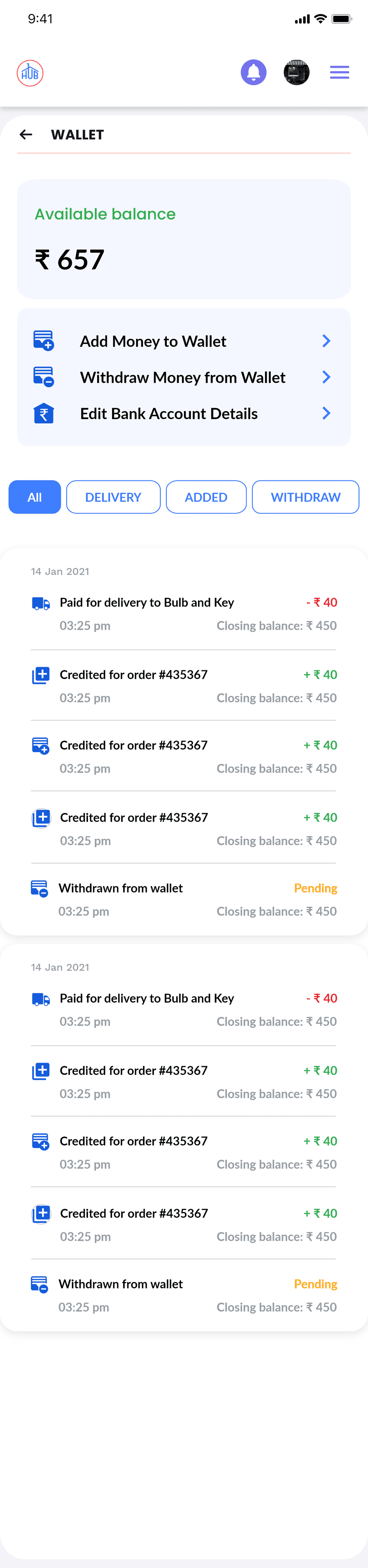

Wallet and payments
Wallet and payments
The wallet allows the seller to manage funds for paying delivery fees. In this section, the seller can:
The wallet allows the seller to manage funds for paying delivery fees. In this section, the seller can:
Add or Withdraw Money:
Enter the desired amount.
Proceed to the payment gateway.
Complete the transaction and receive a success confirmation.
Enter the desired amount.
Proceed to the payment gateway.
Complete the transaction and receive a success confirmation.
Edit Bank Details:
Update bank information as needed.
Update bank information as needed.
This process is used for both adding and withdrawing funds.
This process is used for both adding and withdrawing funds.
conclusion
conclusion